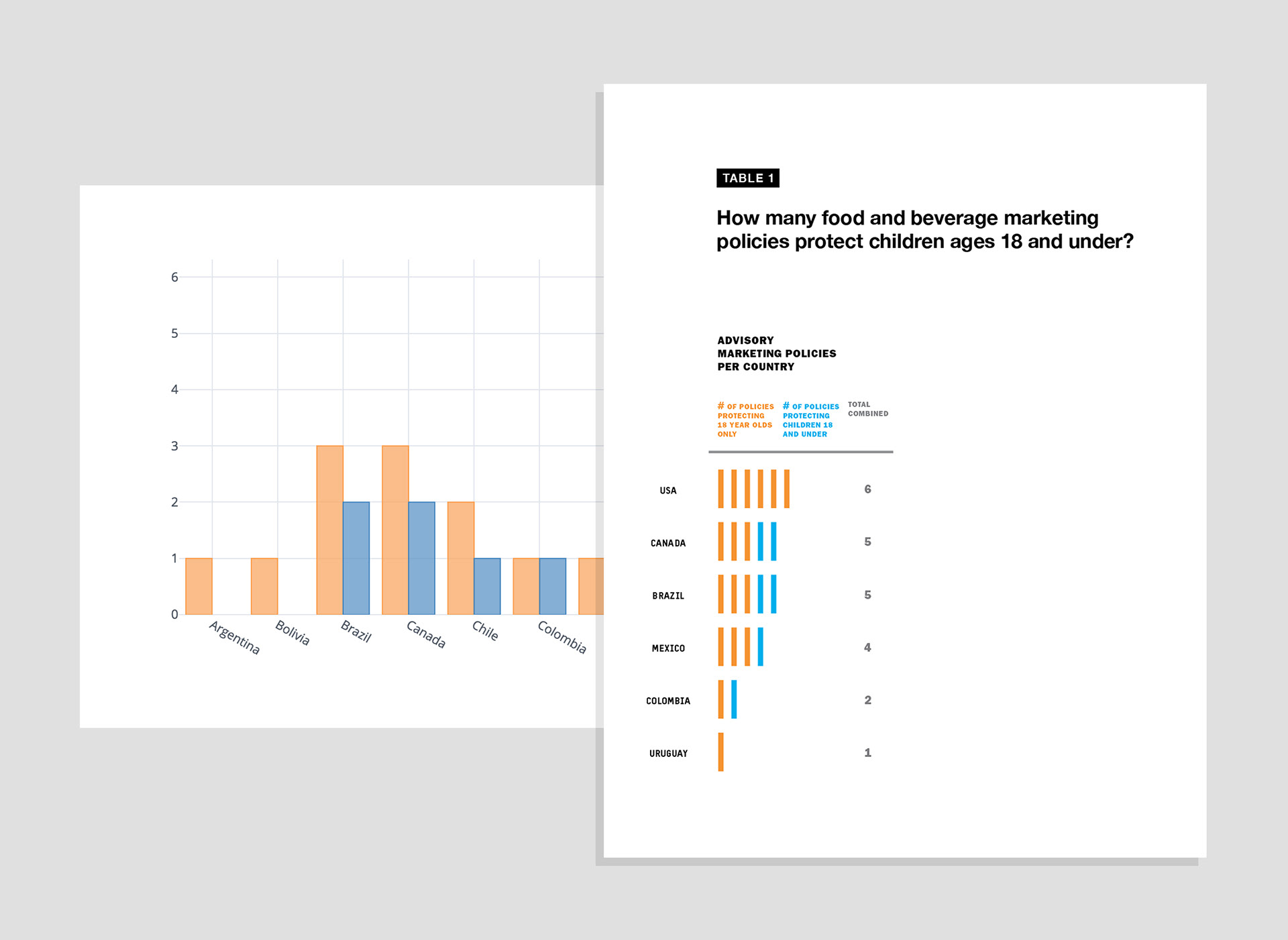
Before and after dataviz. I served as a design consultant for a research project that tracked the marketing of unhealthy food and beverage products to children.
On the left, is data visualized in Tableau, using default settings. On the right, is how that information could be redesigned to be more effectively read.
On the left, is data visualized in Tableau, using default settings. On the right, is how that information could be redesigned to be more effectively read.
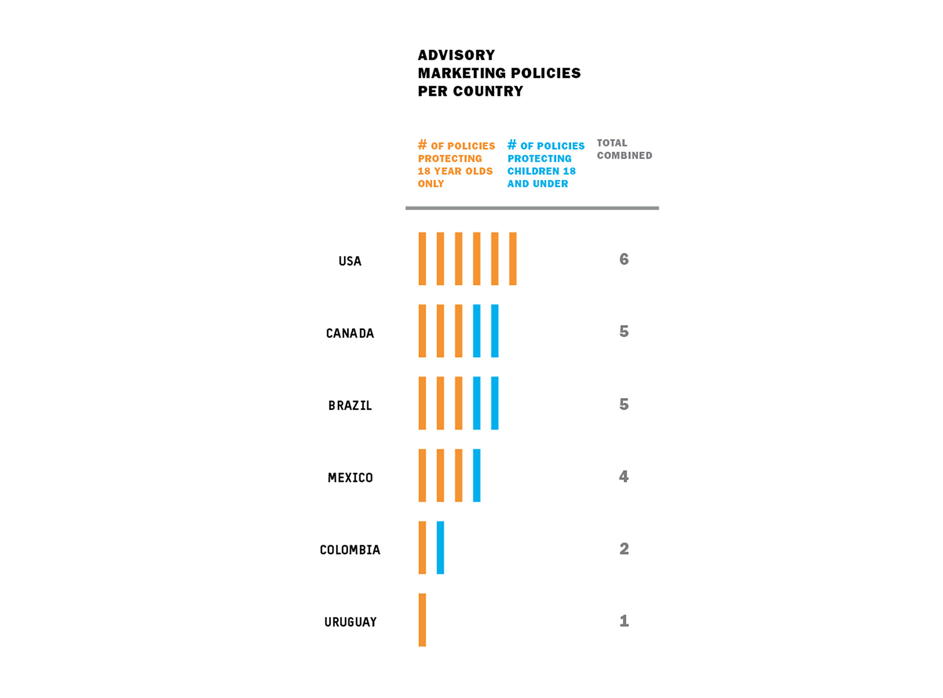
This bar chart has been flipped for a horizontal comparison. The bars are now striated and color-coded, so that quantities are easily tallied. The "total combined" column offers a secondary way to process quantities, as well.
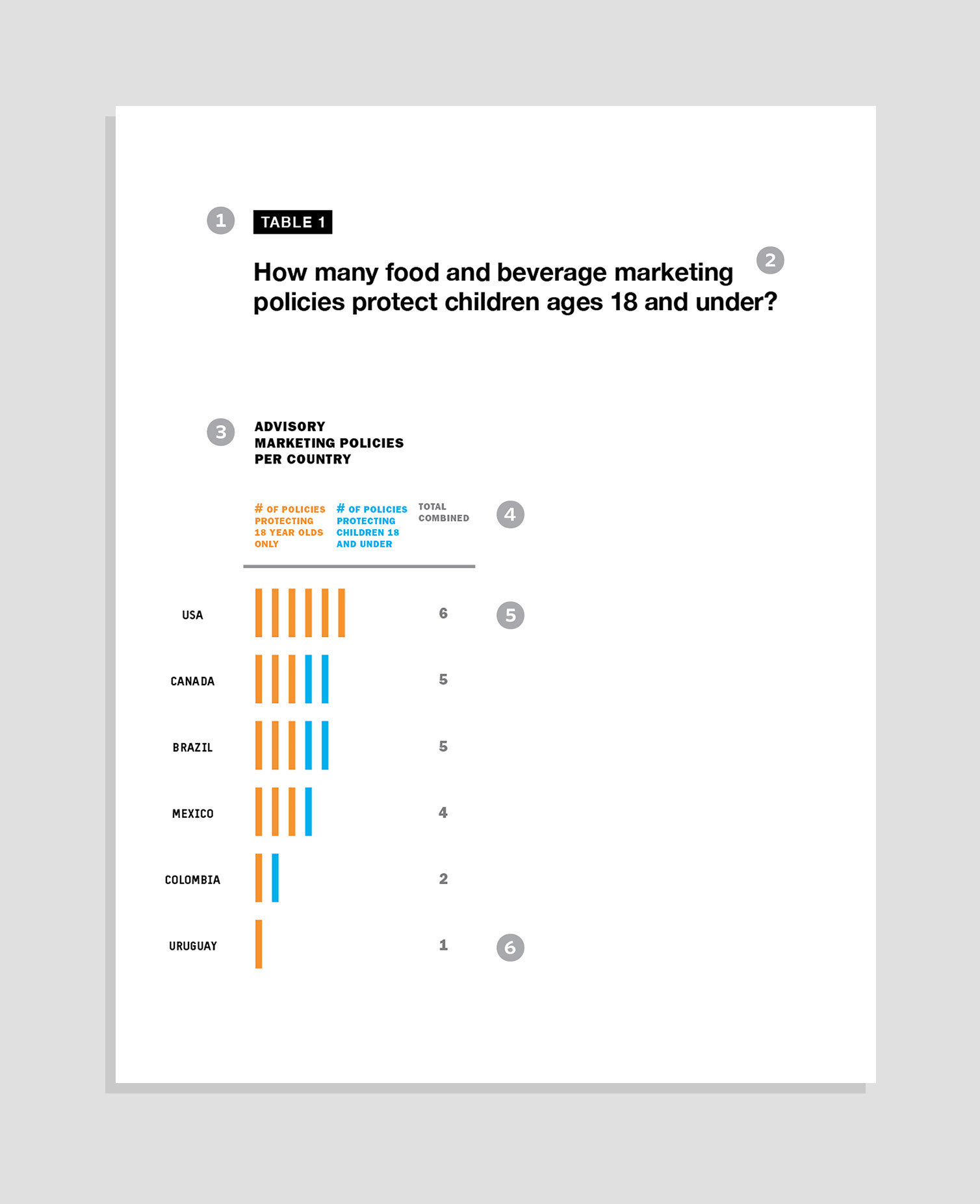
Redesigning default charts from Tableau through:
1. Creating multi-level type hierarchy
2. Posing the title as a question to grab attention
3. Adding clarifying language to help explain the data
4. Color-coding type to sync with data
5. Flipping the bar chart for a horizontal read
6. Reordering the list, from alphabetic to quantitative (i.e. large to small)
2. Posing the title as a question to grab attention
3. Adding clarifying language to help explain the data
4. Color-coding type to sync with data
5. Flipping the bar chart for a horizontal read
6. Reordering the list, from alphabetic to quantitative (i.e. large to small)
Project Title:
Transdisciplinary Collaboration to Visually Map Government Policies to Restrict the Marketing of Unhealthy Food and Beverage Products to Children in the Region of the Americas from 2010 – 2017 to Inform Global Public Health Policy
Team:
Vivica I. Kraak (PI)
Sofia Rincón-Gallardo Patiño
with
Eloise Coupey
Kathleen Meaney
Nicholas Polys
Srijith Rajamohan
Amit Ramesh
Note: This is a grant from the Institute for Creativity, Arts and Technology