
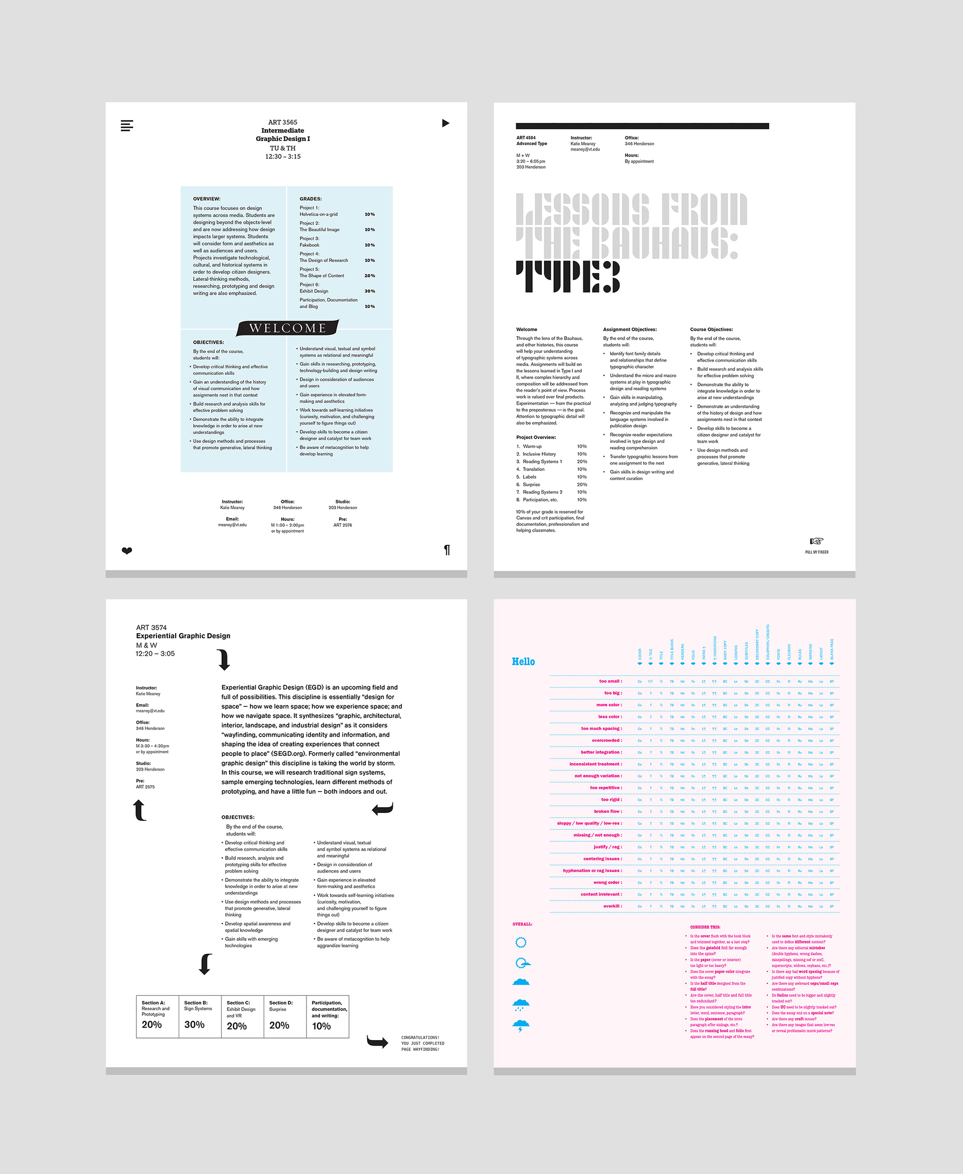
Syllabi and project evaluation. Emphasis is placed on syllabus design as a way to model the practice of designing. These handouts celebrate course topics through the use of innovative type and layout. Also, notice the weather icons on the pink rubric. Not all grades have to be alpha-numeric!
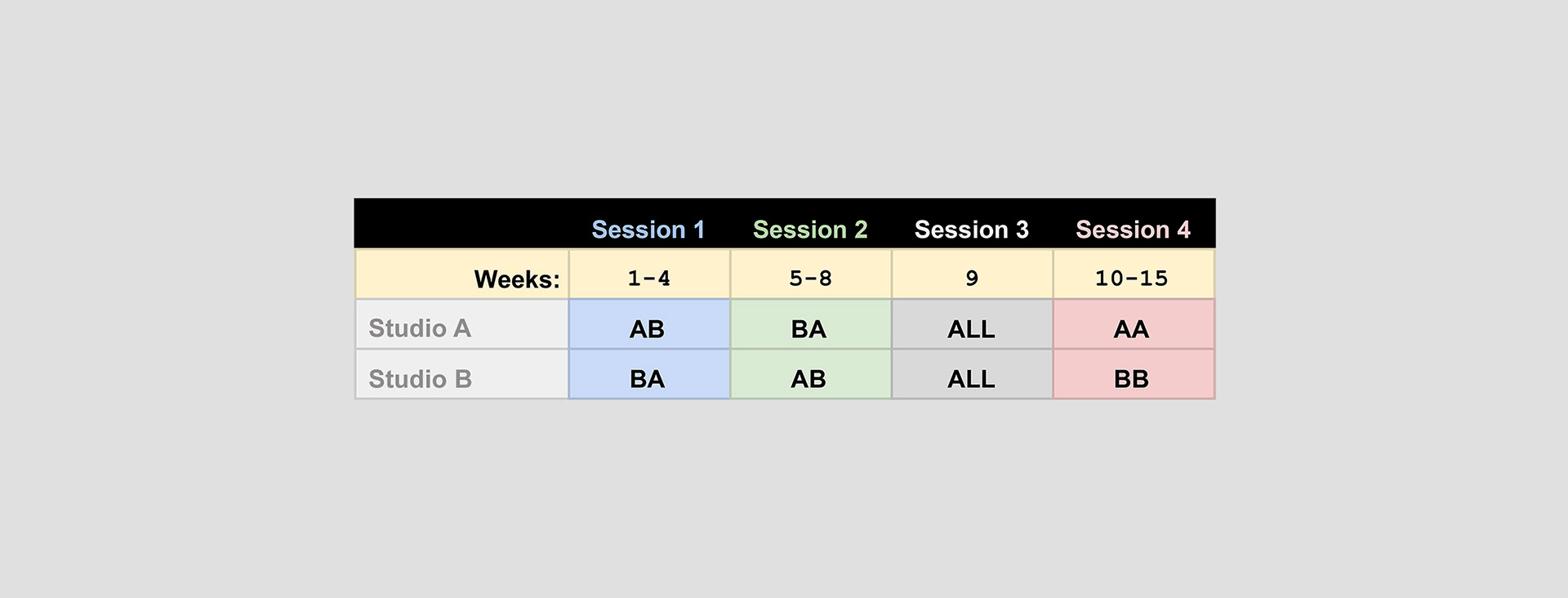
Cross-pollination can happen when two classes are scheduled at the same time. Here is a sample arrangement for how Graphic Design and New Media could overlap, bringing students together from different majors in short sessions.
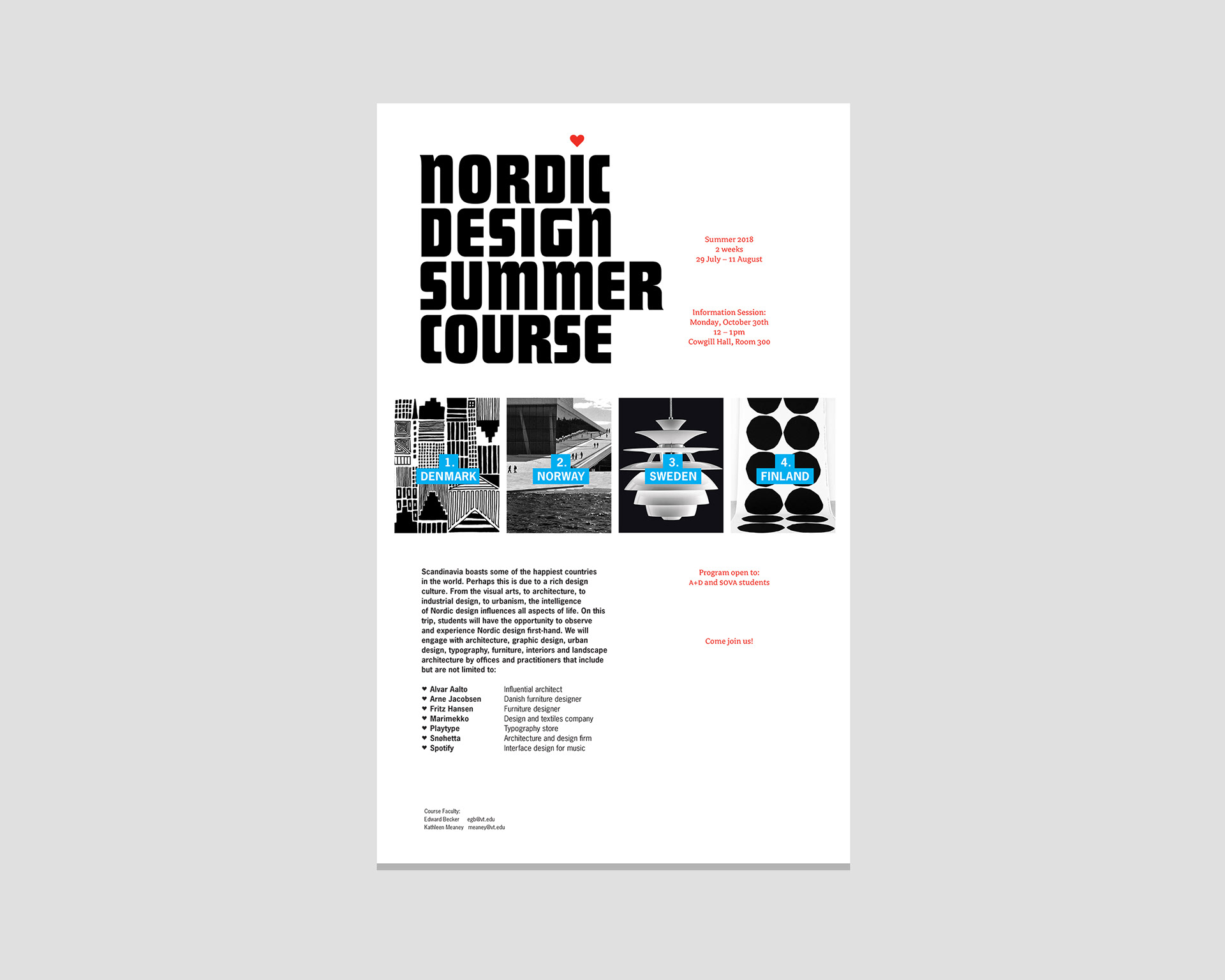

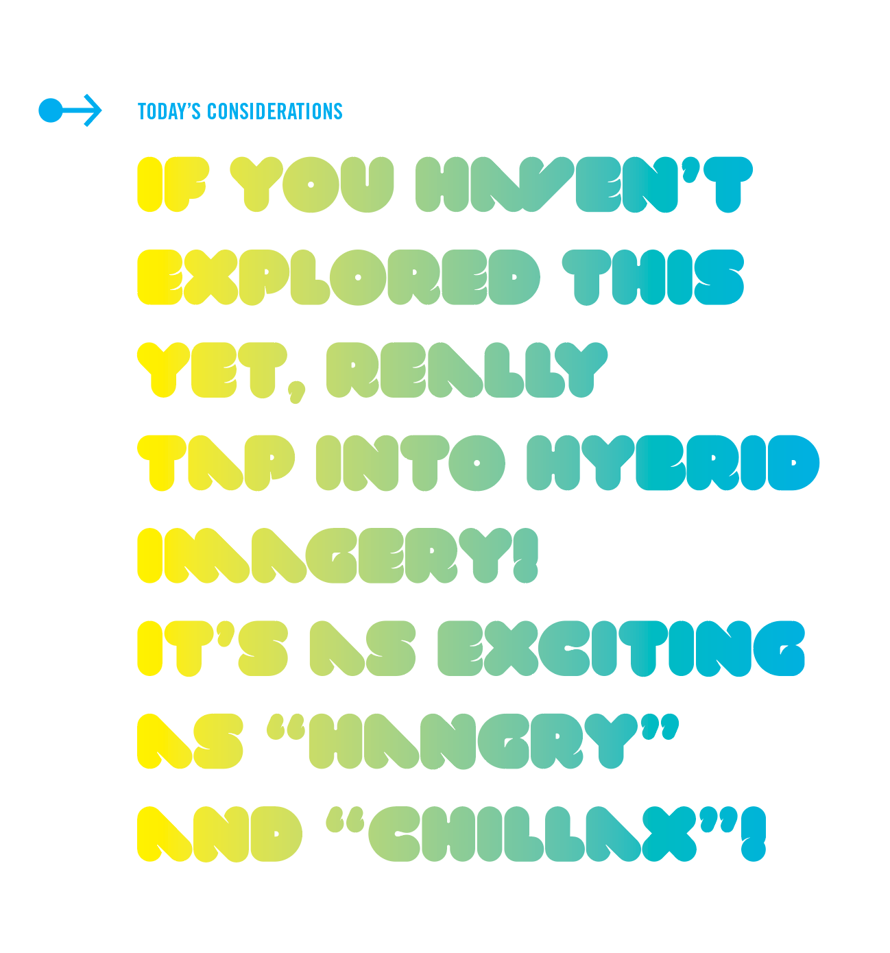
Typographic morsels from different syllabi and course promotional posters.
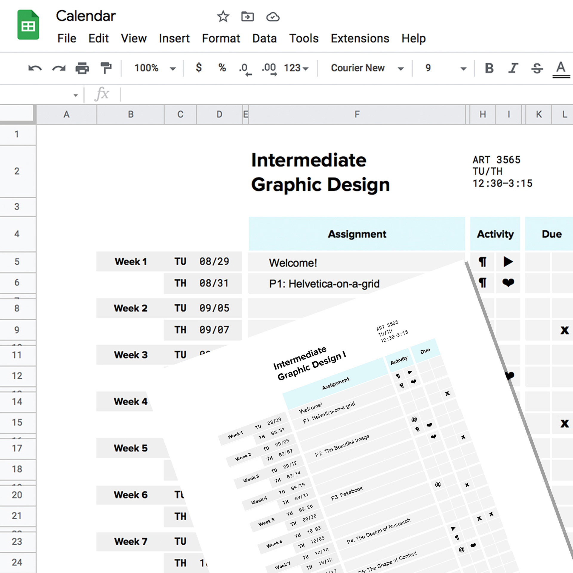
This course schedule is designed using Google Sheets, then exported as a PDF and printed. "Helvetica-on-a-grid" is a phrase coined by Paula Scher, used here to introduce grid systems.
Communications to students increase motivation (hopefully) through their use of novel design methods — and often reinforce in-class demos.

Grading rubric (left) made in Google Sheets and concept maps (right). These concept maps were assignments from a class I audited in Education, taught by (the amazing) Dr. Michelle Wilkins. Lessons from this class were then applied to GD studios.
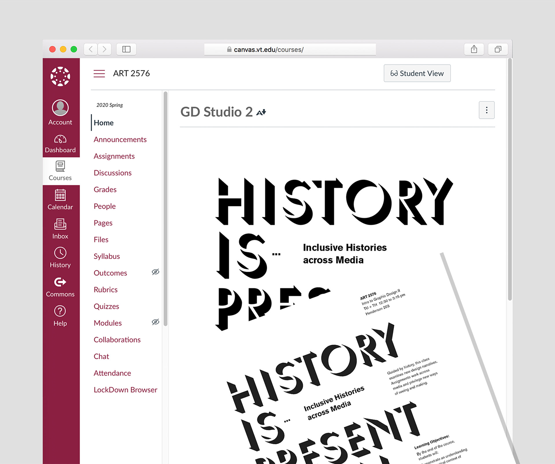
Course "branding" across media (printed syllabi and Canvas LMS).
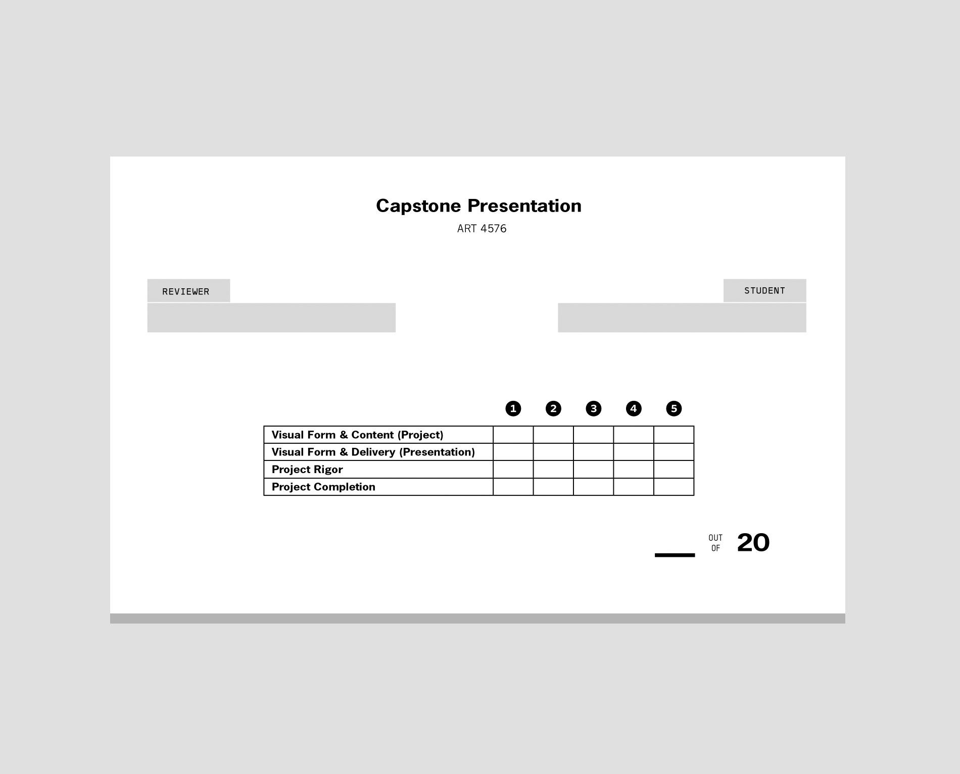
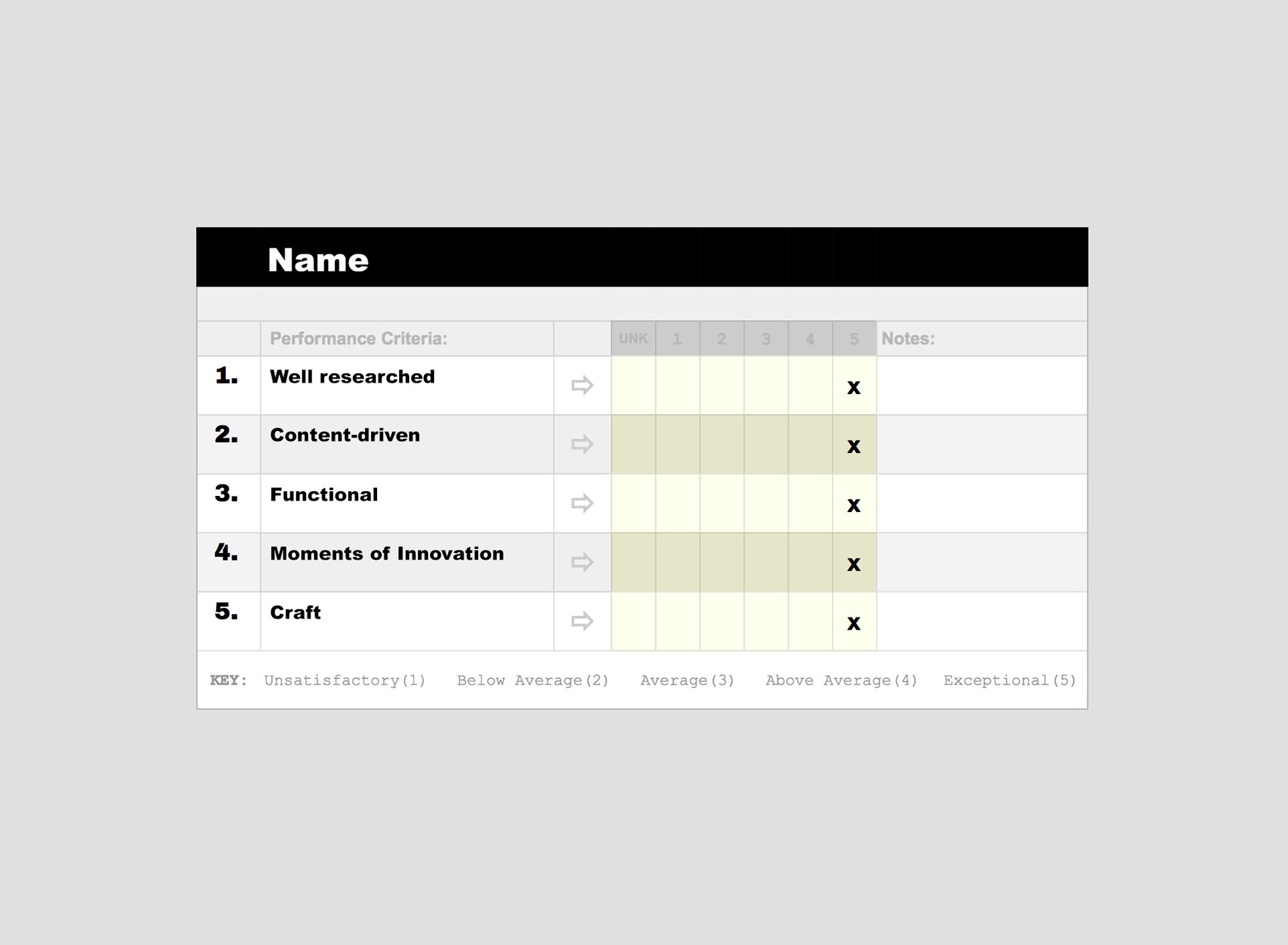
This rubric is for quick assessment during final capstone project presentations. The form also includes a grading key to clarify categories and values (not shown).
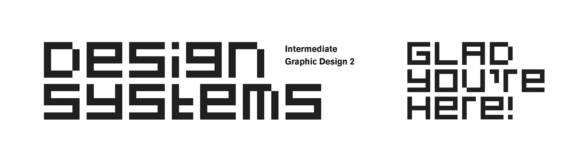
Course syllabi are often designed with thematic fonts. This modular typeface underlines the topic of the semester — design systems and grids.